
First, the artwork. Gordon Crabb's work is of what one might call the 'realist' school: his covers pick out the two or three key characters, in poses and uniforms that suggest instantly their roles, and place them in front of a montage of locations and vehicles which let the reader do an instant join the dots and create a rough and dirty idea of what they're dealing with.
Len tells me of his decision to commission Crabb: "I did nothing other than go through every paperback in Harrods book dept and find that Gordon Crabb's covers were my favorite. After that it was entirely his work. His research was wonderful: he is even more fanatical that I am. He told me that he spent weeks, maybe months, and had to advertise, to get one garment (a riding mac) that was correct for the period. He did about nine covers." Len was supremely confident that Crabb would create covers that spoke to the reader and had a dramatic edge. Interestingly, Len confides: "I never met him." Crabb is nowadays exhibiting as a fine artist.
The covers below (a mixture of original art and the art in situ) are finely detailed and, having read the story, the characters and illustrations are instantly recognisable: with the assassins on the cover of Yesterday's Spy, for example, you can feel your face blasted with the dust blown up by the spinning rear tyre. But here's my question: having seen the front cover, does the image create a character, or rather augment the written word of the author and fix in the reader's mind an image of that character. Does it, in other words, dull the imagination, or inspire it?
I ask because when I first read Berlin Game, Mexico Set and London Match in their original covers, the apple jacket designs by the legendary Ray Hawking were abstract - they hinted at something, riddles you knew would unfold once you opened the covers. Intrigue. Betrayal. Corruption. All in one simple, apple-y metaphor.
There were no characters on display. No gruff Bernard Samson; no sexy, coquettish Tessa Kozinski; no roguish Silas Gaunt. The image I had of these characters was built up page by page, each adjective and adverb adding a layer to the understanding of who that character was. Every reader has his or her own image of the character. So when in 1988, for example, ITV bought to life Bernard, Tess, Silas and others in the TV adaptation, it challenged readers' perceptions of their favourite character. Was Ian Holm really the tall, well-built, bespectacled hero spelt out on the pages of the novel?
Deighton didn't think so; as he explained on this blog recently, he stopped repeats of the series precisely because the actors selected didn't match his understanding - in his mind - of how the characters existed.
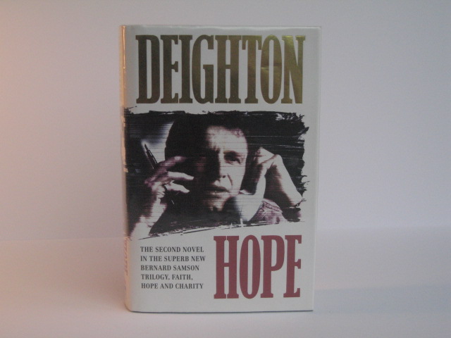
When Faith, Hope and Charity were published by Harper Collins in the mid-nineties, the subtlety of the Hawkey covers was exchanged for photographs by Bebop Alexander, enhanced by Joe Partridge with a brushstroke technique. Here brought to life in photo-realistic detail were the main characters: Bernard, Gloria, Dicky, Bret.
And they were completely different to how I had imagined them. There was now a disconnect between the 'official' characters, and the characters I had conjured up in my imagination. My Gloria was sexier than the Gloria of Partidge's cover; my imagined Samson wore different glasses to the Samson on the cover of Charity. And I felt a little let down. I had to re-callibrate the way I read, the way I imagined the story. Was this the 'official' Samson. Was mine more authentic.
Similarly, readers of Le Carré will have imagined their own Smiley - were they imagining Sir Alec Guinness behind their eyes? Do modern readers of Casino Royale inextricably flash back to Daniel Craig, or is their own idea of Bond stronger?
Perhaps, in the end, it doesn't matter. But it's something that's always stuck with me since seeing the front cover of Faith. Werner wouldn't have a moustache like that, would he?
________
Enjoy Gordon Crabb's cover art selection:


 |
| Original cover art for Declarations of War |
 |
| Original cover art for An Expensive Place to Die |


 |
| Original cover art for Bomber |
 |
| Original cover art for Violent Ward |

For comparison, check out the cover images for Faith, Hope, and Charity:


No comments:
Post a Comment